
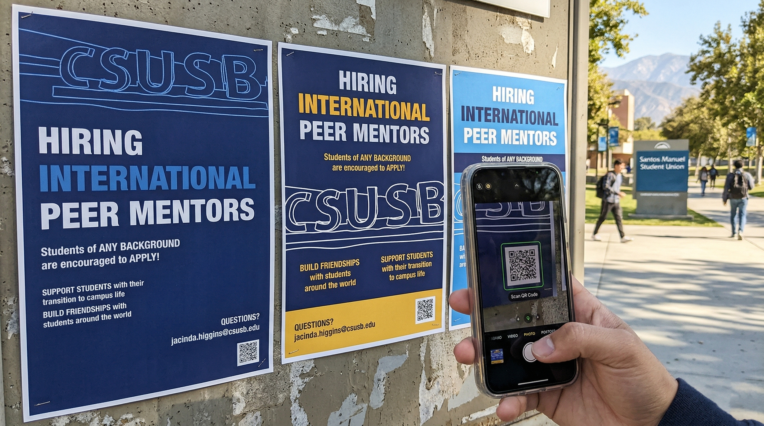
December 5th | 2025I undertook a creative redesign of a poster I spotted on the Cal State San Bernardino campus, crafting three unique versions to showcase different design principles. The first version utilizes the golden ratio to achieve an aesthetically balanced composition, the second employs a multicolumn layout for a clean, organized structure, and the third combines both techniques to create a harmonious blend of the two. Inspired by Swiss design, I focused on minimalism, precision, and functional typography to create a polished, visually engaging poster that maintains clarity while enhancing the original message.
CSUSB Peer Mentor Poster
❋ OverviewThis project reimagines a poster spotted on the Cal State San Bernardino campus, exploring different layout strategies to enhance its visual impact. Inspired by Swiss design, the redesign emphasizes minimalism, precision, and functional typography to create engaging, clear, and polished compositions.
❋ GoalThe goal of this project was to explore and apply different design principles to a single poster, including the golden ratio and multicolumn layouts, to develop balanced, organized, and visually appealing alternatives. The objective was to strengthen clarity, aesthetic harmony, and communication effectiveness while maintaining the poster’s original purpose.
❋ MessageThe project demonstrates how thoughtful layout and typographic choices can transform communication. Each version communicates the original content more effectively while highlighting the power of structure, proportion, and design strategy in visual messaging.
❋ VisualsFor all versions, I incorporated a sketchy, hand-drawn style inspired by the CSUSB campus sign, adding a playful, personal touch to the otherwise precise layouts. Typography and spacing remain clean and minimal, reflecting Swiss design principles while enhancing readability and engagement.